Creating Layouts
Layouts are created using the Layout List interface. Each layout is associated with an Object and configured with a specific display type to organize how records are viewed and managed.
Required Information
- Name: Unique identifier for the layout
- Associated Object: The Object whose records will be displayed in this layout
- Display Type: The type of layout (View360, Simple Layout, Mixed Layout, Estimator, or Flows)
Configuration Steps
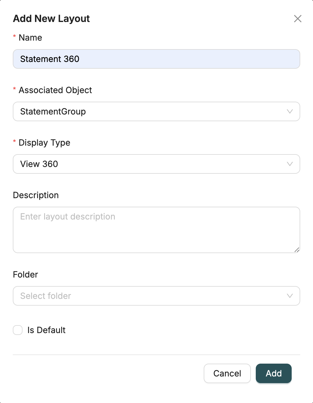
1. Open Layout Creation Dialog
Navigate to the Layouts page and click the "Add Layout" button to open the creation dialog.
2. Enter Layout Name
Provide a unique name for the layout. This name will be used to identify the layout throughout the system.
3. Select Associated Object
Choose the Object that this layout will be associated with. The layout will display records from this Object.
Note: Once a layout is created, the associated object cannot be changed. Make sure to select the correct Object.
4. Select Display Type
Choose the display type for the layout:
- View 360: Comprehensive 360-degree view with multiple sections and tabs
- Simple Layout: Form-based layout with organized field groups
- Mixed Layout: Combination layout with multiple sections and different display types
- Estimator: Specialized layout for price estimation and calculation
- Flows: Layout that displays workflow interfaces
Note: The display type cannot be changed after creation. Choose the appropriate type based on your use case.
5. Enter Description (Optional)
Provide an optional description to explain the purpose or usage of the layout.
6. Select Folder (Optional)
Choose a folder (directory) to organize the layout. Folders help organize layouts for better management and navigation.
7. Set as Default (Optional)
Check the "Is Default" checkbox if this should be the default layout for the associated Object. When a layout is set as default:
- It becomes the primary layout used when viewing or editing records
- If another layout was previously set as default, it will be automatically unset
- Only one default layout can exist per Object per display type
8. Create Layout
Click "Add" to create the layout. After creation:
- The layout is created with an empty configuration
- You are redirected to the layout detail page
- You can now configure sections and fields for the layout
Configuring Layouts
After creating a layout, you'll be taken to the layout detail page where you can configure sections:
What is Simple Layout?
Left: Layout configuration in the designer | Right: How it appears to users in the application
Simple Layout is a form-based layout type designed for straightforward data entry and record viewing. It provides a clean, organized interface where fields are arranged in groups and positioned using a flexible grid system. Simple Layouts are ideal for:
- Data entry forms
- Record detail views
- Quick data capture
- Simple editing interfaces
Configuration Steps
1. Add Field Groups
Field groups help organize related fields together, making the layout more intuitive and easier to navigate.
- Create Groups: Click "Add Field Group" to create a new group
- Name Groups: Give each group a descriptive name (e.g., "Basic Information", "Contact Details", "Address")
- Organize Logically: Group fields that belong together (e.g., all address fields in one group)
- Multiple Groups: You can create as many groups as needed to organize your fields
2. Add Fields to Groups
Once you have field groups, add fields from your Object to each group.
- Drag and Drop: Drag fields from the Object field tree and drop them into the desired group
- Field Selection: Select any field from the associated Object or related Objects
- Multiple Fields: Add multiple fields to each group
- Reorder Fields: Drag fields within a group to reorder them
3. Configure Field Properties
Each field in a Simple Layout can be configured with various properties to control its behavior and appearance.
- Visibility: Show or hide fields based on conditions or user permissions
- Read-Only: Make fields read-only to prevent editing
- Required: Mark fields as required to enforce data entry
- Validation Rules: Set custom validation rules for field values
- Display Options: Configure how fields are displayed (labels, placeholders, help text)
- Default Values: Set default values for fields
4. Grid Layout System
Simple Layouts use a flexible grid system that allows you to position fields precisely and create responsive layouts.
Position Fields: Each field has x and y coordinates that determine its position in the grid
- X Coordinate: Horizontal position (column)
- Y Coordinate: Vertical position (row)
Field Dimensions: Control field size using width (w) and height (h) properties
- Width (w): Number of grid columns the field spans (e.g., w=1 spans 1 column, w=2 spans 2 columns)
- Height (h): Number of grid rows the field spans
- Column Spanning: Fields can span multiple columns to accommodate longer content or create emphasis
- Responsive Design: The grid automatically adjusts to different screen sizes
- Side-by-Side Fields: Position fields next to each other by placing them in the same row with different x coordinates
- Stacked Fields: Place fields vertically by incrementing the y coordinate
Best Practices
- Logical Grouping: Group related fields together (e.g., personal information, contact details)
- Consistent Spacing: Use consistent spacing between fields for a clean appearance
- Important Fields First: Place the most important fields at the top of the layout
- Appropriate Field Widths: Use wider fields for longer content (like descriptions) and narrower fields for short values (like phone numbers)
- Visual Hierarchy: Use field grouping and spacing to create a clear visual hierarchy
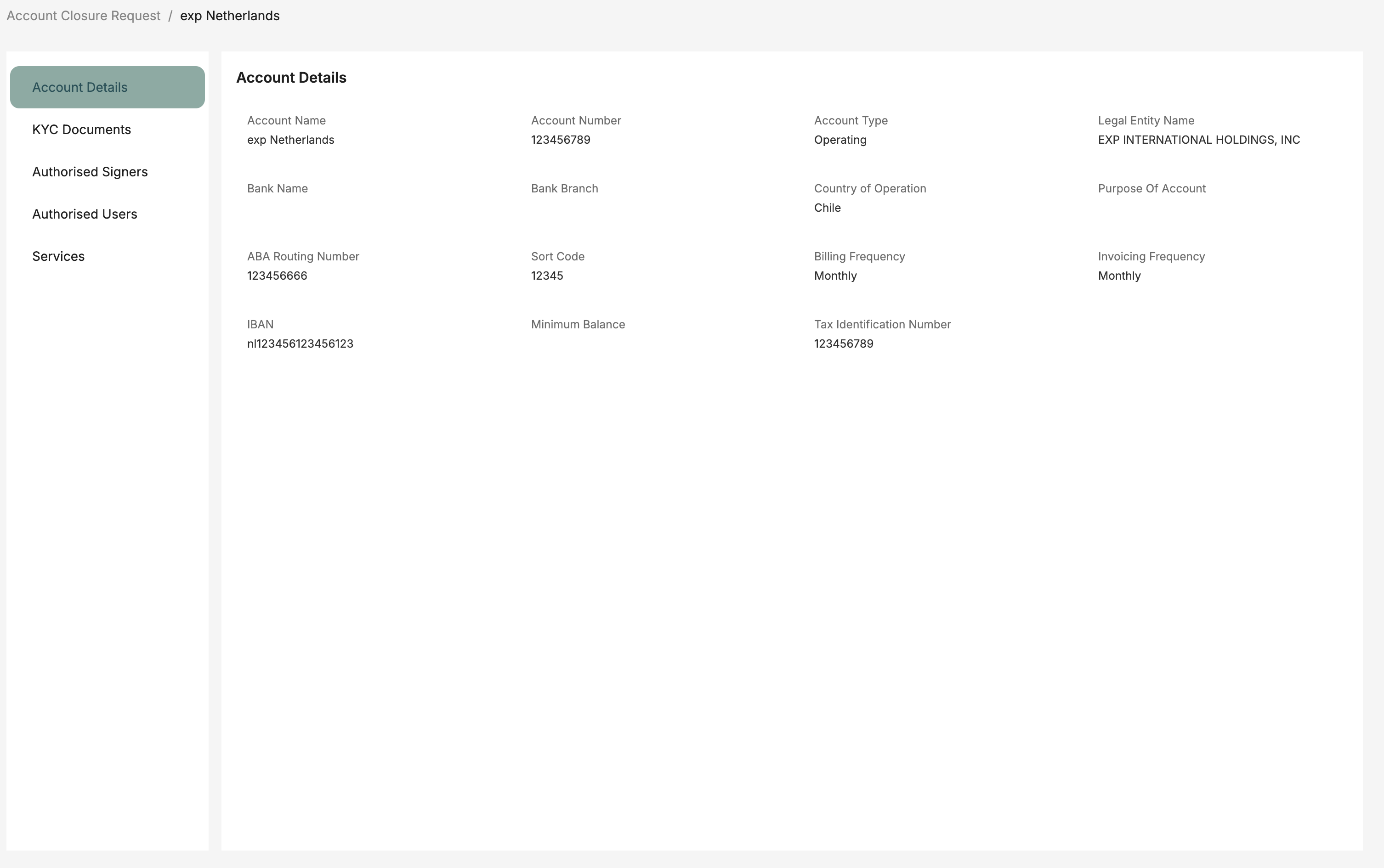
What is View360 Layout?
Left: Layout configuration in the designer | Right: How it appears to users in the application
View360 Layout provides a comprehensive 360-degree view of a record with multiple tabs and sections. It's designed to display all related information about a record in an organized, tabbed interface. View360 Layouts are ideal for:
- Comprehensive record overviews
- Displaying related records from multiple Objects
- Complex data relationships
- Executive dashboards and detailed views
- Multi-entity record management
Configuration Steps
1. Add Tabs
Tabs organize different aspects of the record into separate views, making it easier to navigate complex information.
- Create Tabs: Click "Add Tab" to create a new tab
- Name Tabs: Give each tab a descriptive name (e.g., "Overview", "Orders", "History", "Documents")
- Organize Content: Group related sections within the same tab
- Multiple Tabs: Create as many tabs as needed to organize all related information
- Tab Order: Reorder tabs by dragging them to change the display order
2. Add Sections Within Tabs
Each tab can contain multiple sections, each displaying different types of content or related records.
- Add Section: Click "Add Section" within a tab
- Section Types: Choose from various entity types (see Entity Types below)
- Multiple Sections: Add multiple sections to each tab
- Section Order: Arrange sections vertically within a tab
- Section Titles: Give each section a descriptive title
3. Configure Entity Types
Each section can display different types of content. Choose the entity type that best fits your needs:
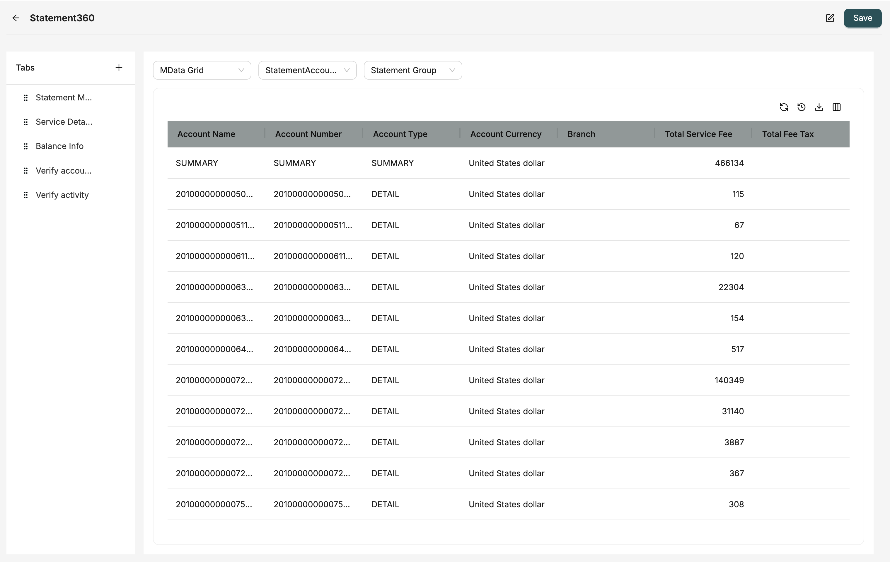
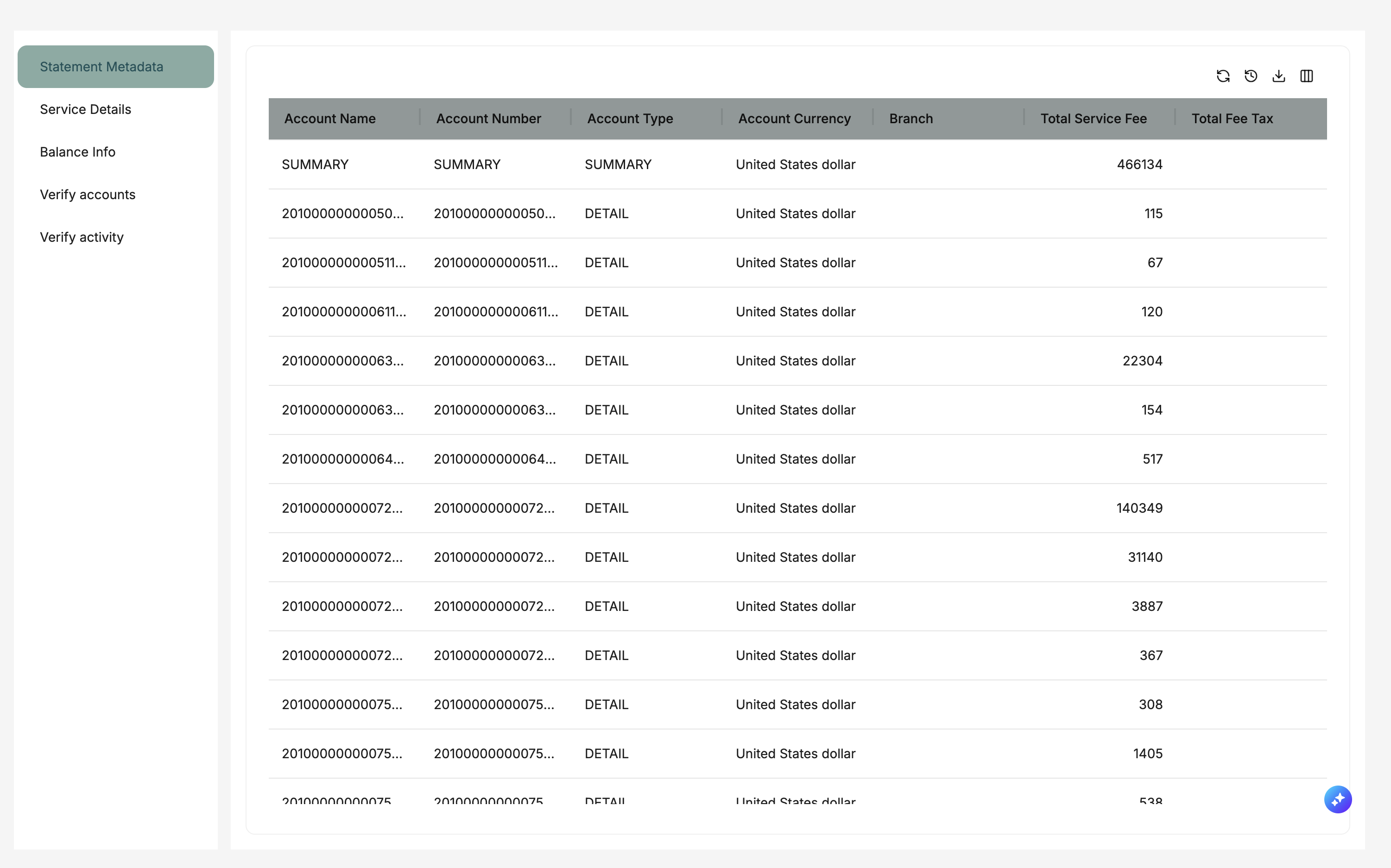
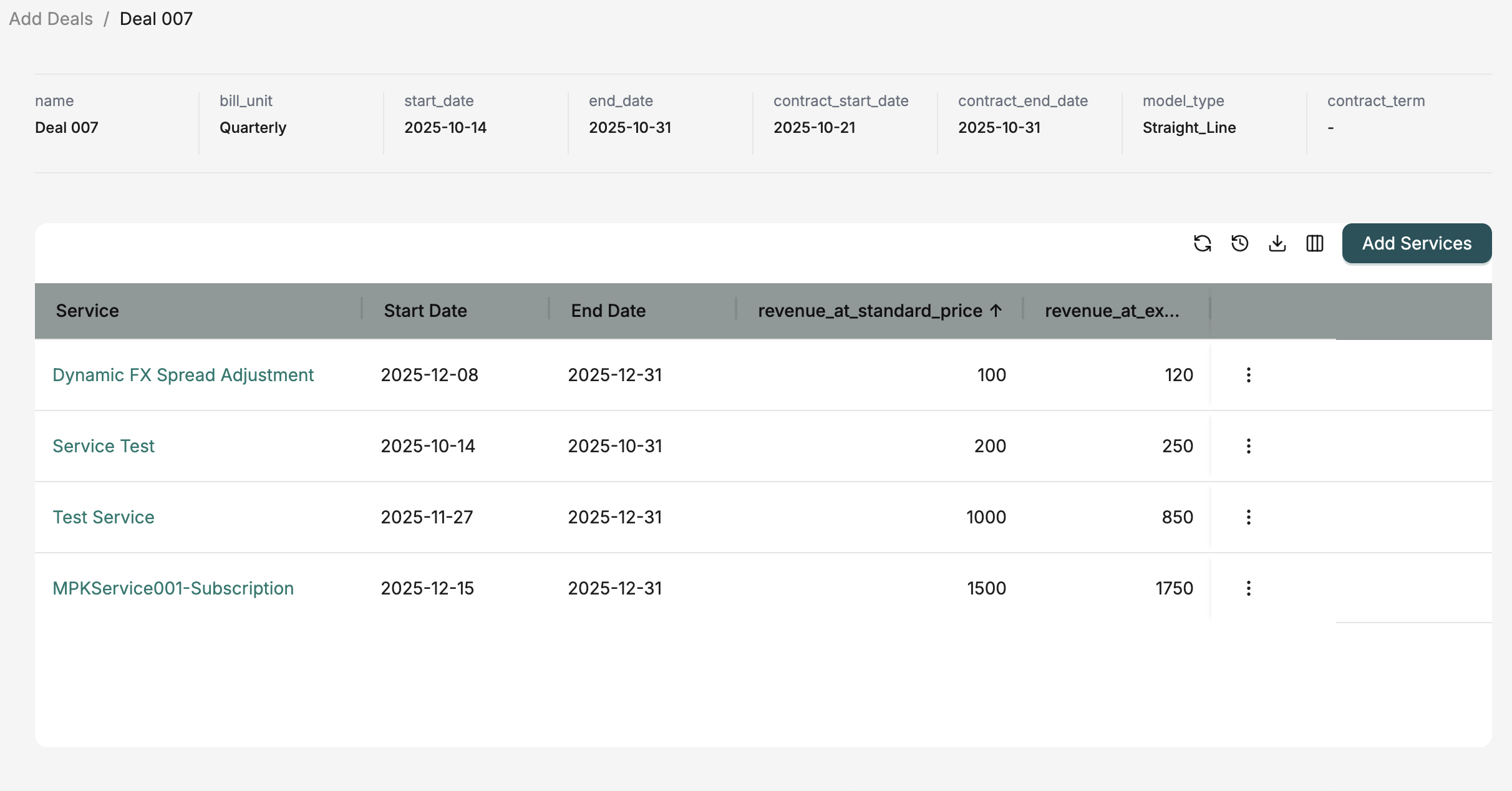
MData Grid
Display datagrids showing related records in a tabular format.
- Use Case: Show lists of related records (e.g., orders for a customer, tasks for a project)
- Configuration: Select a datagrid to display
- Filtering: Use lookup fields to filter records related to the current record
- Interactions: Users can view, add, edit, and delete records directly from the grid
Simple Layout
Embed another simple layout to display related records in a form format.
- Use Case: Show detailed information about related records (e.g., contact details for a customer)
- Configuration: Select a Simple Layout to embed
- Lookup Field: Set a lookup field to filter and show only related records
- Filtering: The embedded layout automatically filters records based on the current record
Standard Layout
Add standard components like expressions, layout configurations, and price matrices.
- Expression: Display calculated values or expressions
- Layout Configuration: Configure layout-specific settings
- Price Matrix: Display pricing information in a matrix format
Estimator
Add price estimation and calculation components.
- Use Case: Display pricing calculations, quotes, or estimates
- Configuration: Configure estimation rules and formulas
- Dynamic Pricing: Calculate prices based on various factors
MFlow
Display workflow interfaces and process management.
- Use Case: Show workflow steps, approvals, or process status
- Configuration: Select a workflow (MFlow) to display
- Interactions: Users can interact with workflow steps directly from the layout
Section
Create nested sections for additional grouping and organization.
- Use Case: Group related sections together
- Nesting: Create hierarchical organization of content
- Organization: Improve visual organization of complex layouts
4. Set Lookup Fields
Lookup fields are crucial for filtering related records and ensuring sections display only relevant data.
- When to Use: When adding a Simple Layout or MData Grid section
- How it Works: The lookup field filters the embedded content to show only records related to the current record
- Example: In a Customer View360, adding an Orders MData Grid with "customerId" lookup field shows only orders for that customer
- Field Selection: Choose a lookup field that establishes the relationship between records
- Automatic Filtering: Records are automatically filtered when the View360 is opened
5. Configure Permissions
Control what users can do with sections, including adding, editing, and deleting records.
- Add Permission: Allow or restrict users from adding new records in sections
- Edit Permission: Control whether users can edit existing records
- Delete Permission: Control whether users can delete records
- Role-Based: Permissions can be set based on user roles
- Section-Specific: Each section can have different permission settings
Best Practices
- Logical Tab Organization: Organize tabs by functional area (e.g., Overview, Financial, History)
- Related Data Together: Group related sections in the same tab
- Clear Tab Names: Use descriptive tab names that clearly indicate their content
- Proper Lookup Fields: Always set appropriate lookup fields to ensure correct data filtering
- Permission Management: Set appropriate permissions for each section based on user needs
- Performance Considerations: Limit the number of sections per tab to maintain good performance
What is Mixed Layout?
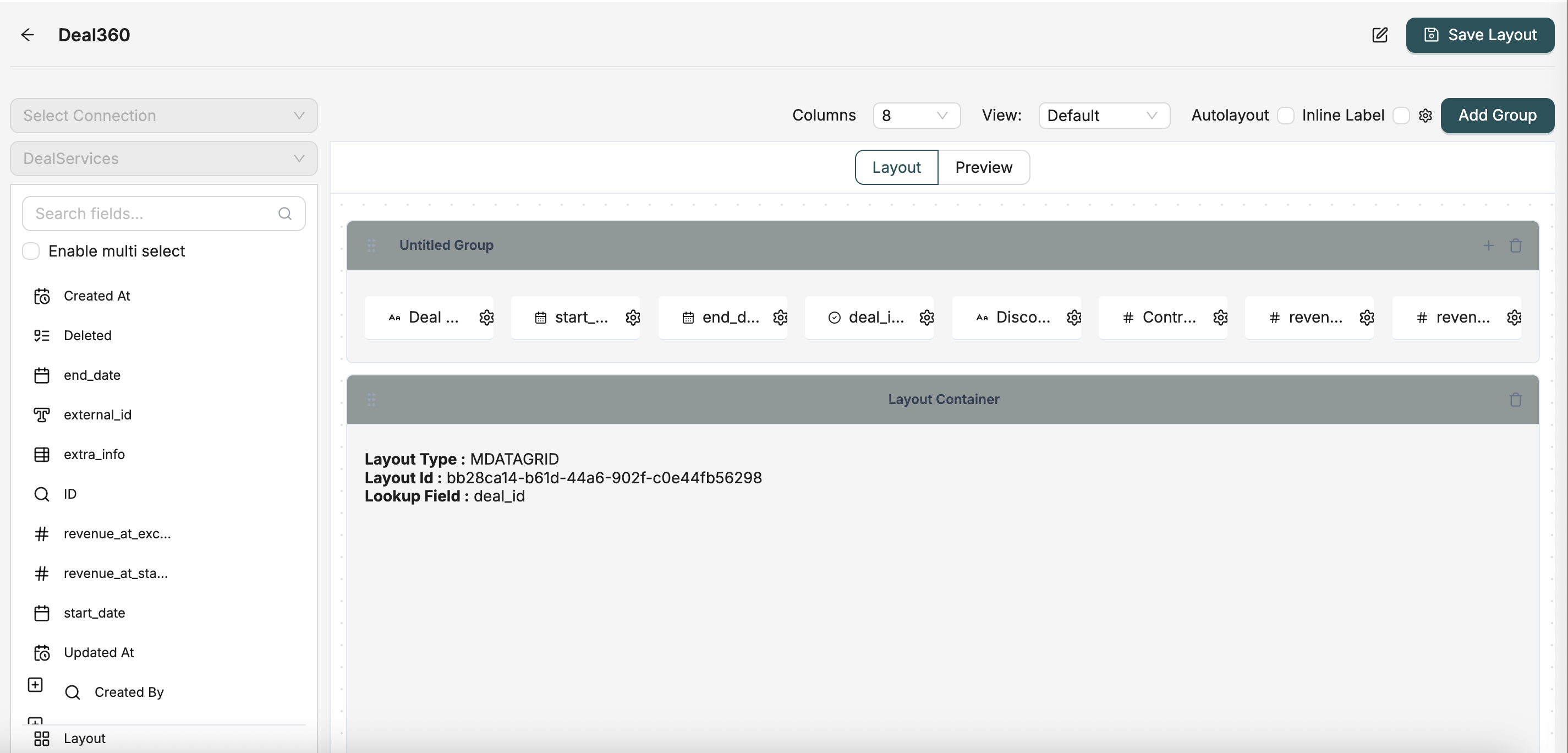
Left: Layout configuration in the designer | Right: How it appears to users in the application
Mixed Layout combines the form-based approach of Simple Layout with the ability to embed datagrids, creating a hybrid interface that displays both form fields and related record lists. Mixed Layouts are ideal for:
- Record detail views with related record lists
- Forms that need to show related data grids
- Combining form fields and tabular data in one view
- Complex record management interfaces
- Dashboards with both form and grid components
Configuration Steps
1. Add Field Groups
Field groups work the same way as in Simple Layouts - they organize form fields into logical sections.
- Create Groups: Click "Add Field Group" to create a new group
- Name Groups: Give each group a descriptive name
- Add Fields: Drag and drop fields from the Object into groups
- Configure Fields: Set field properties like visibility, validation, and display options
- Position Fields: Use the grid system to position fields within groups
2. Add Layout Containers
Layout containers allow you to embed datagrids within the layout, displaying related records in a tabular format.
- Create Container: Click "Add Layout Container" to add a new container
- Container Purpose: Containers hold datagrids that display related records
- Multiple Containers: You can add multiple containers to display different datagrids
- Position Containers: Use the grid system to position containers alongside field groups
3. Configure Layout Containers
Each layout container needs to be configured to display a specific datagrid and optionally filter records.
Select a Datagrid
- Choose Datagrid: Select the datagrid you want to display in the container
- Datagrid Source: The datagrid must be associated with a related Object
- Display Format: The datagrid will display records in its configured format (columns, filters, etc.)
- Interactions: Users can interact with the datagrid (view, add, edit, delete records)
Set Lookup Field (Optional)
- Purpose: Filter the datagrid to show only records related to the current record
- When to Use: When you want to show related records (e.g., orders for a customer)
- How it Works: The lookup field establishes the relationship and filters records automatically
- Example: In a Customer Mixed Layout, set "customerId" as the lookup field for an Orders datagrid container
- Without Lookup: If no lookup field is set, the datagrid shows all records (use with caution)
Position Containers
- Grid Coordinates: Use x, y coordinates to position containers
- Size Containers: Set width (w) and height (h) to control container size
Placement Options:
- Place containers next to field groups (side by side)
- Place containers below field groups (stacked)
- Create custom arrangements based on your needs
4. Grid Layout System
The grid layout system allows you to position both field groups and layout containers precisely, creating flexible and responsive layouts.
Positioning Elements
X Coordinate: Horizontal position (column) in the grid
- Lower x values = left side
- Higher x values = right side
Y Coordinate: Vertical position (row) in the grid
- Lower y values = top
- Higher y values = bottom
- Coordinate System: Both field groups and containers use the same coordinate system
Element Dimensions
Width (w): Number of grid columns the element spans
- w=1: Spans 1 column (narrow)
- w=2: Spans 2 columns (medium)
- w=3 or more: Spans multiple columns (wide)
Height (h): Number of grid rows the element spans
- Controls vertical space
- Larger h values = taller elements
Layout Arrangements
Side by Side: Place elements next to each other by using the same y coordinate and different x coordinates
- Example: Field group at (x=0, y=0) and container at (x=2, y=0)
Stacked: Place elements vertically by using the same x coordinate and different y coordinates
- Example: Field group at (x=0, y=0) and container at (x=0, y=5)
- Custom Arrangements: Combine both approaches for complex layouts
Best Practices
- Balance Form and Grid: Balance the amount of form fields and datagrid containers
- Logical Positioning: Place related field groups and containers near each other
- Use Lookup Fields: Always set lookup fields for containers to show relevant related records
- Appropriate Sizing: Size containers appropriately - wider containers for more columns, taller for more rows
- Visual Hierarchy: Use positioning and sizing to create a clear visual hierarchy
- Responsive Design: Consider how the layout will look on different screen sizes
- Performance: Limit the number of containers to maintain good performance
Layout Settings
Default Layout Behavior
- One Default Per Display Type: Each Object can have one default layout per display type
- Automatic Selection: Default layouts are automatically used when viewing records
- Changing Default: Setting a new layout as default automatically unsets the previous default
Folder Organization
- Optional Organization: Folders are optional but recommended for better organization
- Hierarchical Structure: Folders can be nested for complex organization
- Filtering: You can filter layouts by folder in the layout list
Workflow Integration
After creating a layout, you can optionally associate it with a workflow using the Flow ID field. When a workflow is associated:
- The workflow can be triggered when editing records through the layout
- Custom business logic defined in the workflow is executed
- The workflow can handle data validation, transformations, and side effects
- This is configured in the layout detail/edit page
Lookup Fields
Lookup fields are used to filter related records in View360 layouts:
- When to Use: When adding a Simple Layout section in View360, you can select a lookup field
- How it Works: The lookup field filters the embedded layout's records to show only those related to the current record
- Example: In a Customer View360 layout, adding an Orders Simple Layout with a "customerId" lookup field will show only orders for that customer
Layout Containers (Mixed Layout)
Layout containers in Mixed Layouts allow you to embed datagrids:
- Purpose: Display related records in a grid format within the layout
- Configuration: Select a datagrid and optionally set a lookup field
- Filtering: The lookup field filters the datagrid to show only related records
- Positioning: Containers are positioned using the grid layout system alongside field groups
Best Practices
Naming Conventions
- Use descriptive names that clearly indicate the layout's purpose
- Include the Object name in the layout name for clarity
- Use consistent naming patterns across layouts
Display Type Selection
- View360: Use for comprehensive record views with multiple related data sections
- Simple Layout: Use for straightforward forms and data entry
- Mixed Layout: Use when you need to combine different view types
- Estimator: Use specifically for pricing and estimation workflows
- Flows: Use when displaying workflow interfaces
Default Layouts
- Set a default layout for each Object to ensure consistent user experience
- Choose the most commonly used layout as the default
- Consider user roles when selecting default layouts
Folder Organization
- Organize layouts by Object or by functional area
- Use folders to group related layouts together
- Keep folder structures simple and intuitive
Related Introduction
- Layouts Introduction - Overview of layouts
- Objects Introduction - Understand the data models used in layouts
- Workflows Introduction - Learn about workflows used with layouts