Creating Datagrids
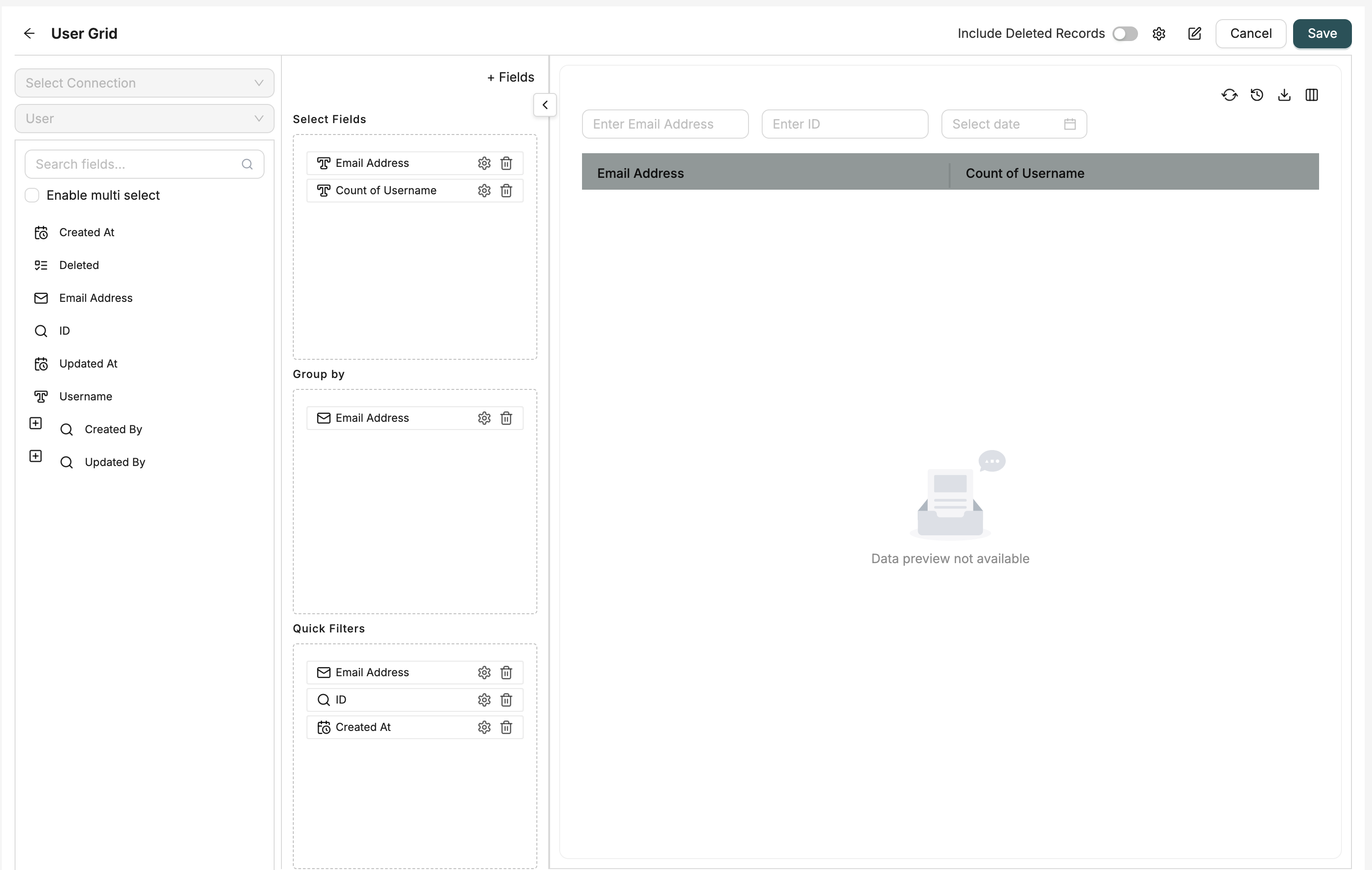
Datagrids are created using the Datagrid Designer interface. Each datagrid is linked to an Object and displays its records in a table format with filtering, sorting, and action capabilities.
Required Information
- Name: Unique identifier for the datagrid
- Description: Optional description
- Object: The Object whose data will be displayed
Configuration Steps
1. Select Object
Choose the Object that contains the data you want to display in the grid. All fields from this Object will be available for selection.
2. Select Fields
Choose which fields to display in the grid. In the designer interface, you'll see a "Show Fields" drag-and-drop area where you can:
- Regular Fields: Standard Object fields
- Formula Fields: Calculated fields using expressions
How to add fields: Drag fields from the field tree on the left side and drop them into the "Show Fields" section.
Creating Formula Fields
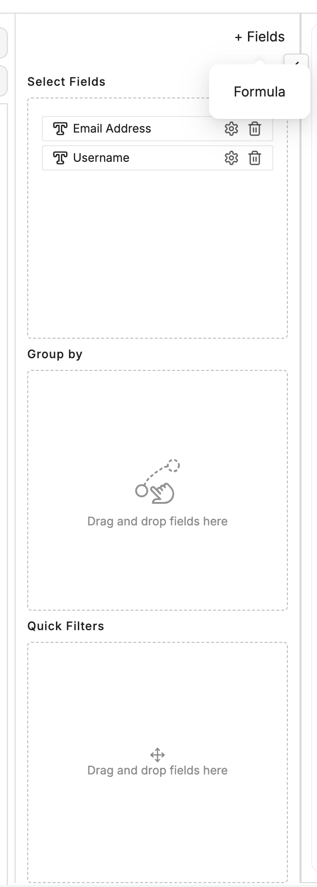
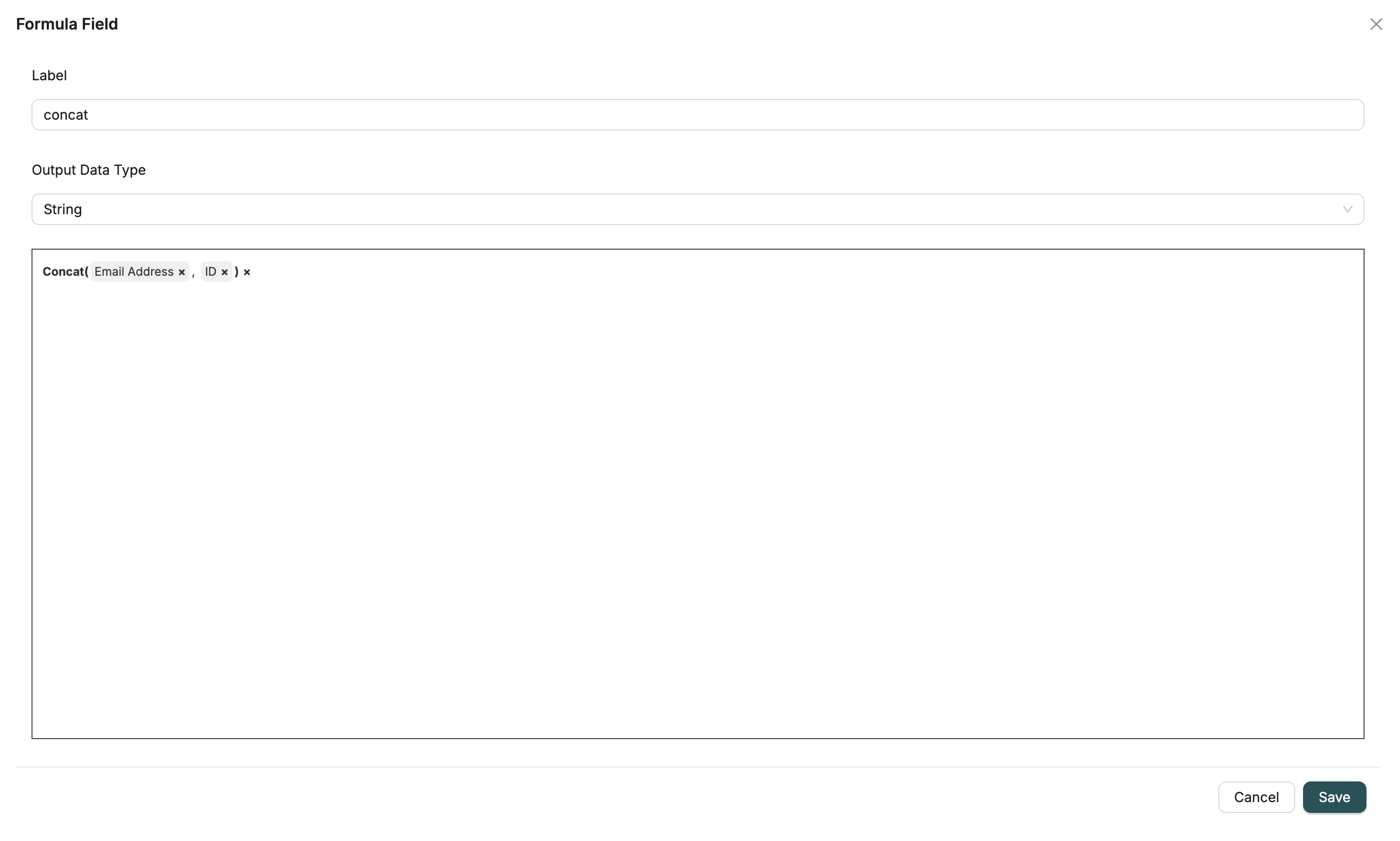
To create a formula field:
- Use the Field Builder component available in the designer interface
- Click to create a new formula field
- Enter an expression using other fields, constants, and operators
- The formula field will be added to your available fields and can be dragged into "Show Fields"
Formula fields allow you to create calculated columns based on expressions involving other fields in your Object.
3. Set Up Grouping (Optional)
Below the "Show Fields" area, you'll find a "Group by" drag-and-drop section.
How to group: Drag fields from the field tree into the "Group By" section. When you group by fields:
- Records are organized hierarchically by the grouped fields
- Non-grouped fields can use aggregation functions (SUM, COUNT, AVG, etc.)
- The grid displays grouped rows with expand/collapse functionality
Note: You can group by multiple fields for hierarchical grouping.
4. Configure Quick Filters
Below the "Group by" section, you'll find a "Quick Filters" drag-and-drop area.
How to add quick filters: Drag fields from the field tree into the "Quick Filters" section. These filters will:
- Appear above the grid as filter inputs for easy access
- Allow users to quickly filter records without opening advanced filter dialogs
- Support common filter operations (contains, equals, greater than, etc.)
Configuring filter display: Each quick filter field has a "Show as Quick Filter" option that controls whether it appears above the grid.
4.5. Configure Field Settings (Optional)
Each field in the "Show Fields" section has configurable settings. Click the settings icon next to any field to configure:
- Display Name: Custom column header text (overrides the default field label)
- Hide Column: Toggle to hide the column from the grid (useful for fields used in calculations but not displayed)
- Column Width: Resize columns directly in the preview pane - widths are saved automatically
- Data Orientation: Set alignment for cell content (Left, Center, Right)
- Header Orientation: Set alignment for header text (Left, Center, Right)
- Show as Tags: For picklist fields, display values as tags instead of plain text
Column Resizing: You can resize columns directly in the preview pane by dragging the column borders. The column widths are automatically saved when you save the datagrid.
5. Include Soft Deleted Records (Optional)
Toggle the "Include Soft Deleted" switch to include or exclude soft-deleted records in the grid. When enabled, records that have been soft-deleted (marked as deleted but not permanently removed) will appear in the grid results.
6. Configure Actions (Optional)
Add actions that can be triggered from the grid:
- Header Actions: Actions available at the grid level
- Row Actions: Actions available for each record row
Actions can trigger forms, workflows, flow chains, or downloads.
7. Configure Drill-Down (Optional)
Set up drill-down links to navigate to related pages or detailed views when clicking on specific columns.
8. General Settings
Configure additional settings:
- Sort Options: Define default sort order using order by fields
- Hide Chat View: Toggle chat view visibility
- Custom Headers: Enable custom column headers
- Flow: Associate a workflow with the datagrid
9. Save Datagrid
Provide a name and description, optionally select a folder for organization, and save the datagrid.
UI Layout
The datagrid designer has three main drag-and-drop areas stacked vertically:
- Show Fields (top): Fields to display as columns in the grid
- Group by (middle): Fields to group records by
- Quick Filters (bottom): Fields to show as quick filter inputs above the grid
All three areas use the same drag-and-drop mechanism - drag fields from the field tree on the left and drop them into the appropriate section.
Field Types
Regular Fields
Standard fields from the selected Object. These display actual data values from records.
Formula Fields
Calculated fields that use expressions to compute values based on other fields or constants.
Quick Filters
Quick filters are fields that appear as filter inputs above the grid:
- Easy Access: Users can filter records without opening dialogs
- Common Filters: Best for frequently used filter fields
- Show/Hide: Each field has a "Show as Quick Filter" option to control visibility
- Filter Operations: Supports various operations like contains, equals, greater than, less than, etc.
How it works: When you drag a field into the "Quick Filters" section, it becomes available as a filter input above the grid. Users can enter values directly in these inputs to filter the displayed records.
Grouping
Group records by fields to organize data hierarchically:
- Single Field Grouping: Group by one field to organize records by that field's values
- Multiple Field Grouping: Group by multiple fields for nested hierarchical organization
- Aggregations: When grouping, non-grouped fields can use aggregation functions (SUM, COUNT, AVG, MIN, MAX)
- Expand/Collapse: Grouped rows can be expanded or collapsed to show/hide detail records
How it works: When you drag fields into the "Group by" section, the grid organizes records by those fields. The grid displays grouped rows that can be expanded to show individual records within each group.
Field Settings
Each field in your datagrid can be customized with various settings:
Display Name
Override the default field label with a custom column header. This is useful for:
- Making technical field names more user-friendly
- Providing context-specific labels
- Localizing column headers
Hide Column
Hide columns from the grid while keeping them available for:
- Calculations in formula fields
- Filtering purposes
- Grouping operations
Hidden columns are still part of the datagrid configuration but are not visible to users.
Column Width
Columns can be resized directly in the preview pane:
- Drag the column border to adjust width
- Widths are automatically saved when you save the datagrid
- Useful for optimizing the display of different data types
Data and Header Orientation
Control the alignment of content and headers:
- Left: Default for text fields
- Center: Useful for centered content
- Right: Default for numbers and currency (data orientation)
Show as Tags (Picklist Fields)
For picklist fields, you can display values as tags instead of plain text:
- Makes multi-select picklist values more visually distinct
- Improves readability for fields with multiple values
- Tags are color-coded for better visual organization
Editing Existing Datagrids
To edit an existing datagrid:
- Navigate to the datagrid list
- Click the Edit button for the datagrid you want to modify
- Make your changes in the designer interface
- Click Save to update the datagrid
All changes are saved to the existing datagrid configuration.
Related Introduction
- Datagrids Introduction - Overview of datagrids
- Configuring Actions - Learn how to configure grid actions, drill-down, and settings
- Objects Introduction - Understand Objects and their fields
- Workflows Introduction - Learn about workflows used in datagrid actions