Creating Reports
Reports are created using the Report Designer interface. Each report queries data from Objects and displays it using various visualization types.
Required Information
- Name: Unique identifier for the report (required)
- Object: The data source for the report (required)
- Show Fields: At least one field to display (required)
- Visualization Type: The type of chart or view to display (required)
Configuration Steps
1. Open Report Designer
Navigate to the Reports page and click the "Create Report" button (or similar action) to open the Report Designer interface.
2. Select Object
Choose the Object that contains the data you want to report on. This Object serves as the primary data source for your report.
How to select: Use the Object selector in the left panel to browse and select an Object.
Note: Once an Object is selected, all its fields become available for use in the report configuration.
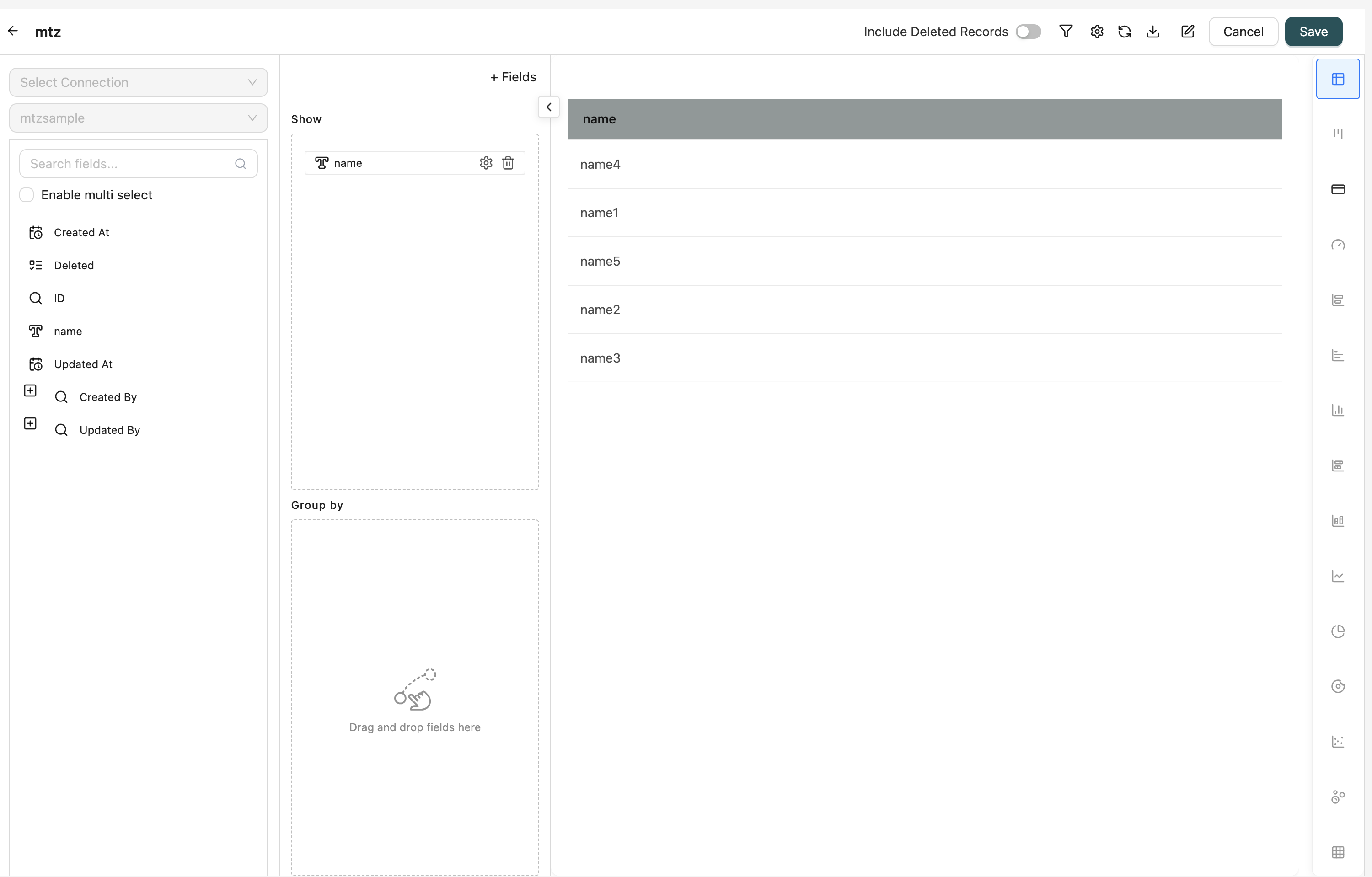
3. Configure Show Fields
Add fields that you want to display in the report. These fields appear as columns in table views or as data points in charts.
How to add fields:
- Drag fields from the field tree on the left side
- Drop them into the "Show" drag-and-drop area
Field Types:
- Regular Fields: Standard Object fields
- Formula Fields: Calculated fields using expressions
- Case Fields: Fields with conditional logic
Field Settings: Each field has a settings icon where you can configure:
- Display Name: Customize the column header
- Aggregation: For numeric fields, choose aggregation (SUM, AVG, COUNT, MIN, MAX, etc.)
- Pivot: Enable pivoting for cross-tabulation
- Column Calculations: Add calculations like sum, average, count
- Number Formatting: Format numeric values
- Date Summarization: Summarize date fields by day, week, month, etc.
- Hide: Hide the field from display
- Show as Tag: Display picklist values as tags
4. Configure Group By Fields (Optional)
Add fields to group data by. Grouping organizes data hierarchically and enables aggregation.
How to add fields:
- Drag fields from the field tree
- Drop them into the "Group By" drag-and-drop area
How it works:
- Records are organized by the grouped fields
- Non-grouped fields can use aggregation functions
- Grouping enables pivot table functionality
Field Settings: Group By fields have settings for:
- Display Name: Customize the group header
- Pivot: Enable pivoting for cross-tabulation
- Row Group: Configure row grouping behavior
- Date Summarization: Summarize date fields
5. Configure Filters (Optional)
Apply filters to narrow down the data displayed in the report.
How to configure:
- Click the Filter icon in the top toolbar
- The filter modal opens with two tabs:
- Fields Tab: Configure WHERE conditions for regular fields
- Measures Tab: Configure HAVING conditions for aggregated fields
Filter Configuration:
- Fields Tab: Filter data before aggregation
- Use the Query Builder to create filter conditions
- Combine multiple conditions with AND/OR logic
- Filter by field values, dates, numbers, etc.
- Measures Tab: Filter aggregated data after grouping
- Filter by aggregated values (e.g., SUM > 1000)
- Apply conditions to calculated measures
Clear Filters: Click "Clear Filter" to remove all filter conditions.
6. Include Soft Deleted Records (Optional)
Toggle whether to include soft-deleted records in the report.
Default: Disabled (only active records shown)
How to toggle: Use the "Include Soft Deleted" switch in the top toolbar.
Note: This option is only available when an Object is selected.
7. Select Visualization Type
Choose how you want to visualize the data. The available visualization types depend on your field configuration.
Available Types:
- Grid/Table: Display data in a table format
- Bar Chart: Compare values across categories
- Line Chart: Show trends over time
- Pie Chart: Display proportions and percentages
- Donut Chart: Similar to pie chart with center hole
- Column Chart: Vertical bar chart
- Stacked Bar: Horizontal bars with stacked segments
- Stacked Column: Vertical columns with stacked segments
- Scatter Chart: Show relationships between two variables
- Bubble Chart: Scatter chart with size as third dimension
- KPI: Display key performance indicators
- Kanban: Display data in kanban board format
- Heat Map: Display data density with colors
- Progress Bar: Show progress indicators
- Card View: Display data as cards
- Sankey: Show flow relationships
How to select: Click on the visualization type icon in the visualization selector panel.
Note: Some visualization types require specific field configurations (e.g., charts need at least one group by field).
8. Configure Settings
Configure additional settings for your report by clicking the Settings icon (gear icon) in the top toolbar. The Settings dialog contains six tabs:
- General Settings: Sort options, max read limit, row height, flow association, custom headers
- Drill-Down Settings: Configure drill-down navigation to other reports, workflows, or tasks
- KPI Settings: Icon, font styling, variance, and goal configuration for KPI visualizations
- Chart Settings: X-axis, Y-axis, legend, data labels, and visual map settings for charts
- Kanban Settings: Card display, column width, and field visibility for Kanban boards
- Card View Settings: Card layout, field configuration, and display options for card views
For detailed information about each settings tab, see Configuring Report Settings.
9. Execute Report
Click the "Run Report" button (or refresh icon) to execute the report and view the results.
Validation: The system validates your configuration before execution:
- At least one Show field must be configured
- Visualization type must be compatible with field configuration
- Required fields for selected visualization must be present
Results: After execution, the report displays:
- Data visualization based on selected type
- Interactive elements (clicking, filtering, sorting)
- Export options
10. Save Report
Click the "Save" button to save your report configuration.
Save Dialog:
- Name: Enter a unique name for the report (required)
- Description: Provide an optional description
- Folder: Select a folder to organize the report (optional)
After Saving:
- The report is created and appears in the Reports list
- A materialized view is automatically created for performance
- The report can be edited, executed, or deleted as needed
- The report can be used in Builder pages and dashboards
Editing Existing Reports
To edit an existing report:
- Navigate to the Reports page
- Find the report in the list
- Click the "Edit" icon (or click on the report name) in the actions dropdown
- The Report Designer opens with existing configuration
- Make your desired changes
- Click "Save" to apply updates
Note: When editing, all existing configurations are loaded. You can modify fields, filters, visualization, and settings as needed.
Advanced Features
Formula Fields
Create calculated fields using expressions:
- Click to add a formula field
- Enter an expression using other fields, constants, and operators
- The formula field is added to available fields
- Drag the formula field into Show or Group By areas
Use Cases: Calculate totals, percentages, differences, etc.
Case Fields
Create fields with conditional logic:
- Click to add a case field
- Define conditions and corresponding values
- The case field is added to available fields
- Use case fields for categorization and conditional values
Use Cases: Categorize data, apply conditional formatting, create derived categories
Pivot Tables
Enable pivoting for cross-tabulation:
- Add fields to Group By
- Enable Pivot setting on Group By fields
- Configure pivot settings (row groups, column groups)
- View data in cross-tabulated format
Use Cases: Compare data across multiple dimensions, create summary tables
Column Calculations
Add calculations to columns:
- Select a field in Show
- Open field settings
- Configure Column Calculations
- Choose calculation functions (SUM, AVG, COUNT)
Use Cases: Add totals, subtotals, running totals to columns
Best Practices
Field Selection
- Relevant Fields: Select only fields needed for analysis
- Appropriate Aggregations: Use correct aggregation functions for numeric fields
- Meaningful Names: Use display names that are clear to end users
Grouping
- Logical Grouping: Group by fields that make sense for analysis
- Hierarchical Grouping: Use multiple Group By fields for detailed breakdowns
- Date Grouping: Use date summarization for time-based analysis
Filtering
- Efficient Filters: Apply filters early to reduce data volume
- Clear Conditions: Use clear filter conditions that are easy to understand
- Test Filters: Test filters to ensure they return expected results
Visualization Selection
- Appropriate Type: Choose visualization type that best represents your data
- Chart Requirements: Ensure field configuration meets chart requirements
- User Experience: Consider how users will interact with the visualization
Performance
- Limit Fields: Don't select unnecessary fields
- Use Filters: Apply filters to reduce data volume
- Materialized Views: Reports automatically use materialized views for performance
- Max Read Limit: Set appropriate limits for large datasets
Related Introduction
- Configuring Report Settings - Detailed guide to all report settings
- Reports Introduction - Overview of reports
- Objects Introduction - Understand the data sources used in reports
- Workflows Introduction - Learn about workflows associated with reports
- Builder Introduction - Learn how to use reports in Builder pages