Configuring Report Settings
The Report Settings dialog allows you to configure various aspects of your report through six main tabs: General Settings, Drill-Down Settings, KPI Settings, Chart Settings, Kanban Settings, and Card View Settings. Each tab contains specific configuration options for different report types and visualizations.
Accessing Settings
To access report settings:
- Open a report in the Report Designer
- Click the Settings icon (gear icon) in the top toolbar
- The Settings modal opens with tabs for different setting categories
General Settings
Configure general report-wide settings that apply to all report types.
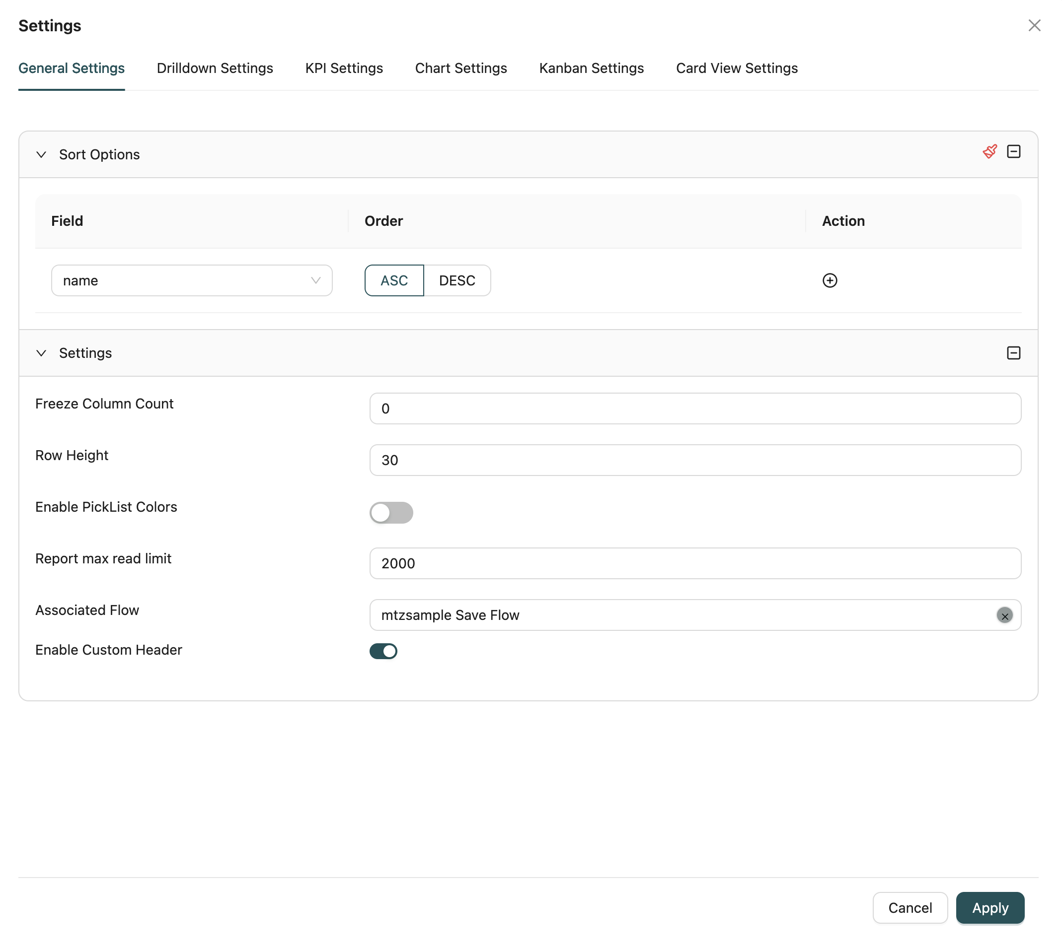
Sort Options
Define the default sort order for the report:
- Add Sort Fields: Click to add one or more fields to sort by
- Select Field: Choose the field to sort by from the dropdown
- Select Order: Choose ascending (ASC) or descending (DESC) order
- Multiple Sorts: Add multiple sort fields for complex sorting (sorts are applied in order)
- Remove Sorts: Delete sort fields that are no longer needed
How it works: The report displays data sorted by the configured fields in the specified order. Multiple sort fields create a hierarchical sort.
Report Settings
Configure various display and behavior settings:
Freeze Column Count
Set the number of columns to freeze (keep visible) when scrolling horizontally in table views.
Default: 0
Use Case: Useful for keeping important columns (like names or IDs) visible while scrolling through wide tables.
Row Height
Configure the height of rows in table views.
Default: System default
Range: Minimum 10 pixels
Use Case: Adjust row height for better readability or to fit more data on screen.
Enable Picklist Colors
Toggle to display picklist values with their associated colors in the report.
Default: Disabled
Use Case: Visual distinction for picklist values makes reports easier to scan and understand.
Report Max Read Limit
Set the maximum number of records to retrieve and display in the report.
Default: System default (typically 10,000)
Range: 0 to maximum allowed limit
Use Case: Limit data retrieval for performance optimization, especially for large datasets.
Associated Flow
Associate a workflow (MFlow) with the report. When a flow is associated:
- The workflow can be triggered from report interactions
- Custom business logic defined in the workflow is executed
- The workflow can handle data validation, transformations, and side effects
How to select: Use the flow selector dropdown to search and select a workflow by name.
Enable Custom Header
Toggle to enable custom column headers. When enabled:
- You can customize header text and formatting
- Headers can differ from field display names
- Useful when data comes from workflows to provide user-friendly labels
Default: Disabled
Drill-Down Settings
Configure drill-down navigation that allows users to navigate to related pages or detailed views when clicking on specific fields or data points.
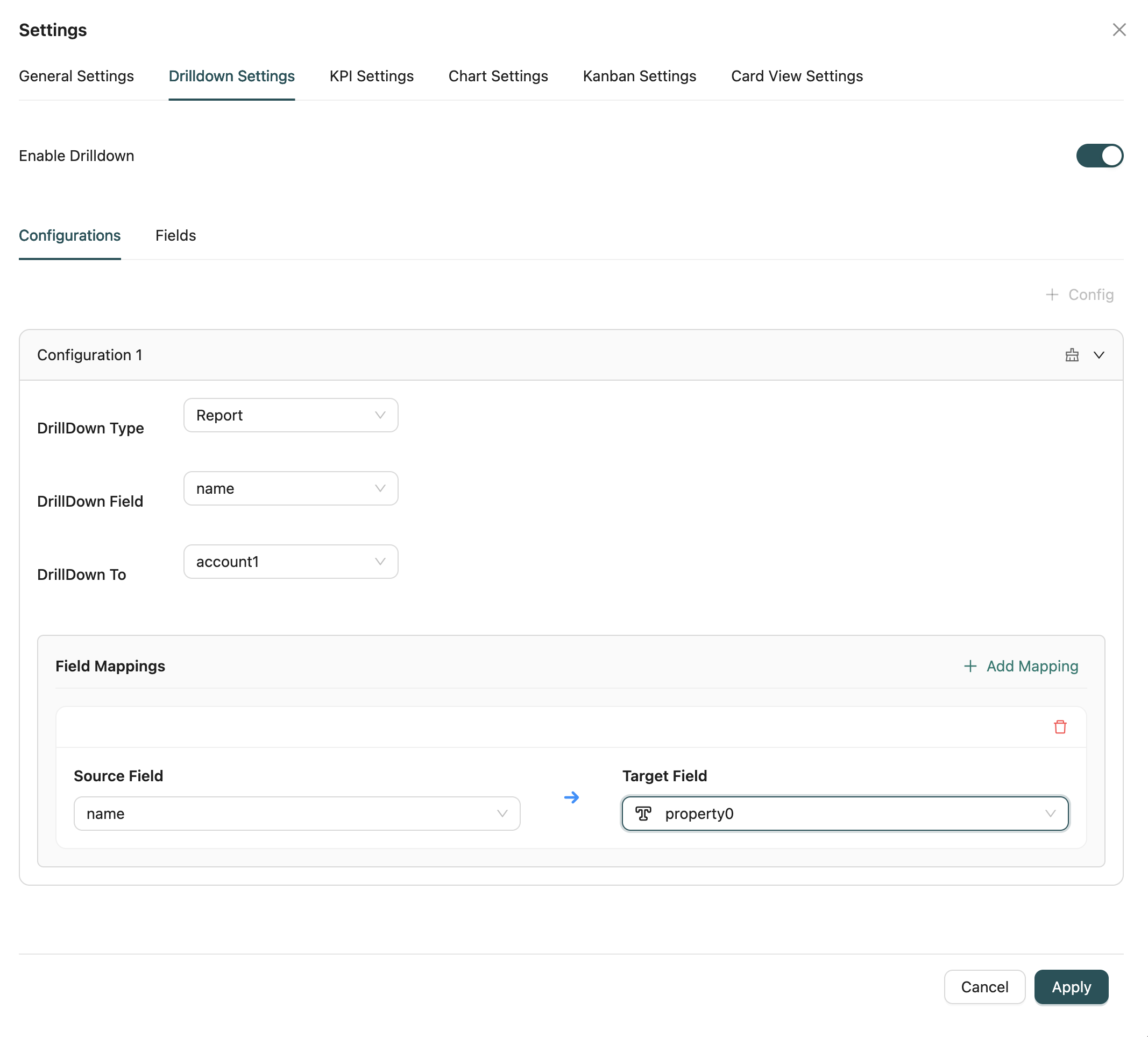
Enable Drill-Down
Toggle to enable or disable drill-down functionality for the report.
Drill-Down Configuration
Configure drill-down definitions with the following options:
Drill-Down Field
Select the field that will trigger the drill-down when clicked. Available fields are from the report's "Show" fields.
Required: Yes (when drill-down is enabled)
Drill-Down Type
Choose the type of target for drill-down navigation:
- Self: Navigate to the same report with filtered data
- Report: Navigate to another report
- Workflow: Navigate to a workflow
- My Tasks: Navigate to user tasks
Required: Yes
Target Selection
Based on the selected drill-down type, choose the specific target:
- For Report: Select a report from the dropdown
- For Workflow: Select a workflow from the dropdown
- For My Tasks: No additional selection needed
Filter Mapping
Configure how fields from the current report map to filter the drill-down target:
- Source Field: Field from the current report
- Target Field: Field in the drill-down target to filter by
- Filter Logic: How the filter is applied (equals, contains, etc.)
Multiple Drill-Down Definitions
You can configure multiple drill-down definitions for different fields, allowing different columns or data points to navigate to different targets.
KPI Settings
Configure settings specific to KPI (Key Performance Indicator) visualizations.
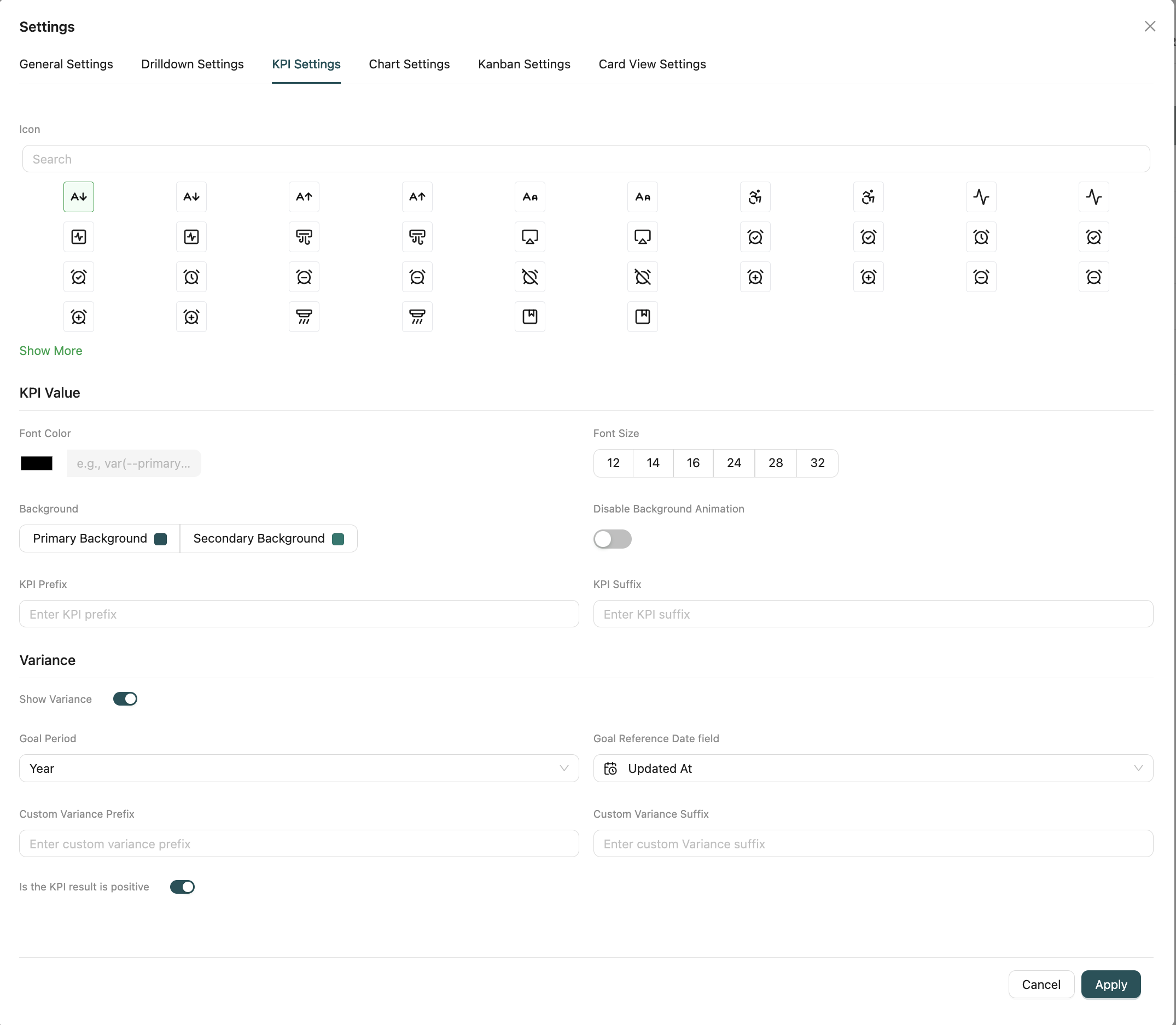
Icon
Select an icon to display alongside the KPI value. Icons help visually identify the KPI type.
How to select: Use the icon picker to browse and select from available icons.
KPI Value Configuration
Configure how the KPI value is displayed:
Font Color
Set the color for the KPI value text. You can use:
- Color picker to select a color
- Hex color code (e.g.,
#000000) - CSS variable (e.g.,
var(--primary))
Font Size
Choose the font size for the KPI value:
Options: 12, 14, 16, 24, 28, 32
Default: System default
Background
Select the background theme for the KPI:
- Primary Background: Uses the primary theme color
- Secondary Background: Uses the secondary/accent theme color
Disable Background Animation
Toggle to disable animated background effects for the KPI.
Default: Disabled (animation enabled)
KPI Prefix
Enter text to display before the KPI value (e.g., "$", "Total: ").
KPI Suffix
Enter text to display after the KPI value (e.g., "%", " units").
Variance Configuration
Configure variance display to compare KPI values against goals:
Show Variance
Toggle to enable variance display, which shows the difference between the current KPI value and a goal value.
Default: Disabled
Goal Period
When variance is enabled, select the time period for goal comparison:
- Last Month: Compare against previous month
- Quarterly: Compare against last 3 months
- Half Year: Compare against last 6 months
- Year: Compare against last 12 months
Goal Reference Date Field
Select a date field from the report's Object to use as the reference for goal period calculations.
Required: Yes (when goal period is selected)
Custom Goal Value
If no goal period is selected, enter a custom numeric goal value to compare against.
Custom Variance Prefix
Enter text to display before the variance value (e.g., "+", "Change: ").
Custom Variance Suffix
Enter text to display after the variance value (e.g., "%", " points").
Is the KPI Result Positive
Toggle to indicate whether higher KPI values are considered positive (good) or negative (bad). This affects variance color coding.
Default: Enabled (higher is positive)
Chart Settings
Configure visualization-specific settings for chart reports (Bar, Line, Pie, etc.).
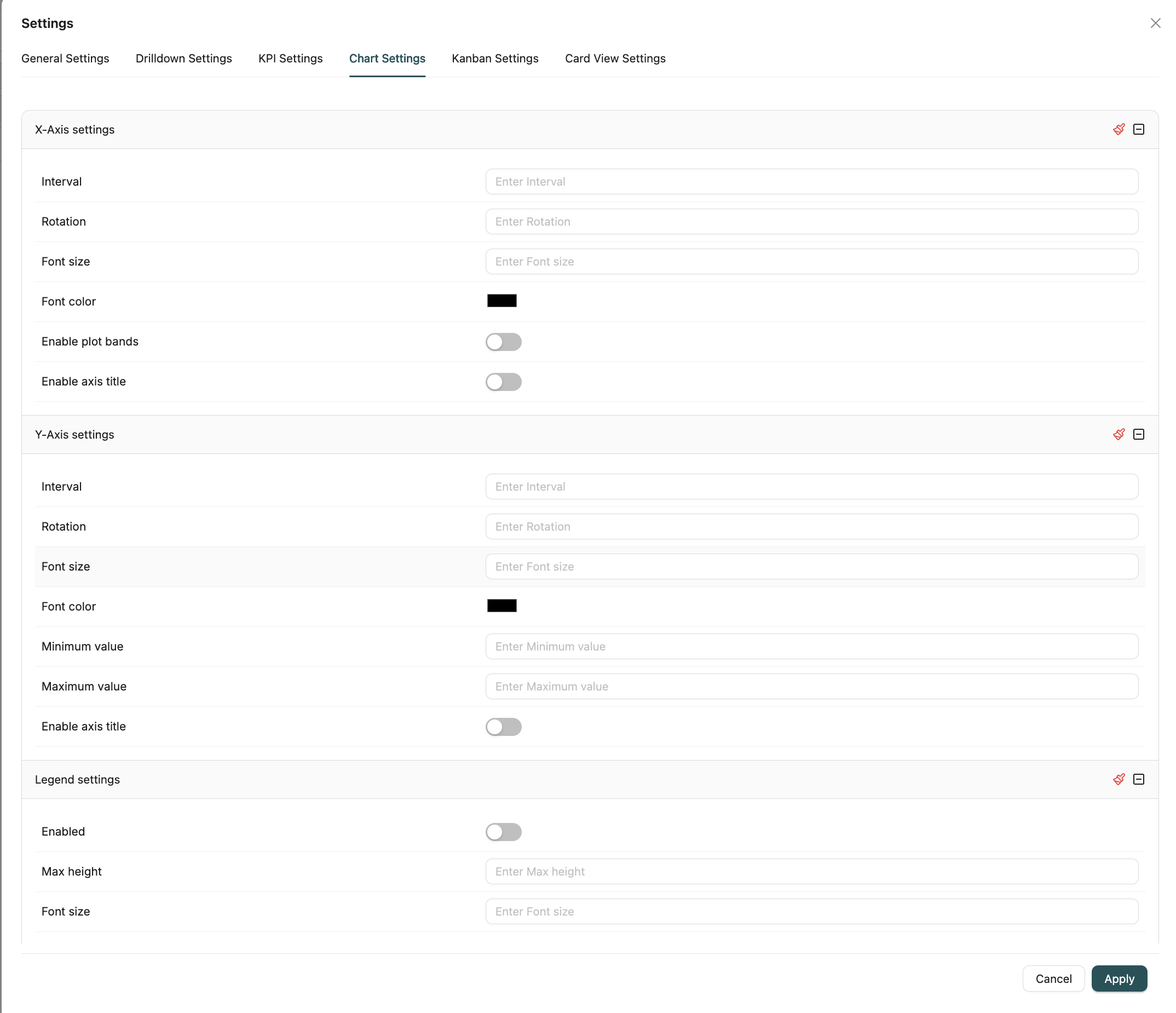
X-Axis Settings
Configure the horizontal axis appearance and behavior:
- Interval: Set the interval between axis labels
- Rotation: Rotate axis labels by degrees (0-90)
- Font Size: Set the font size for axis labels
- Font Color: Set the color for axis labels
- Enable Plot Bands: Toggle to show plot bands (shaded areas) on the axis
- Enable Axis Title: Toggle to show the axis title
Y-Axis Settings
Configure the vertical axis appearance and behavior:
- Interval: Set the interval between axis labels
- Rotation: Rotate axis labels by degrees (0-90)
- Font Size: Set the font size for axis labels
- Font Color: Set the color for axis labels
- Minimum Value: Set the minimum value displayed on the axis
- Maximum Value: Set the maximum value displayed on the axis
- Enable Axis Title: Toggle to show the axis title
Legend Settings
Configure the chart legend:
- Enabled: Toggle to show or hide the legend
- Max Height: Set the maximum height for the legend
- Font Size: Set the font size for legend text
- Font Color: Set the color for legend text
- Align: Set horizontal alignment (Left, Right, Center)
- Vertical Align: Set vertical alignment (Top, Bottom, Middle)
- Layout: Set legend layout (Horizontal, Vertical, Proximate)
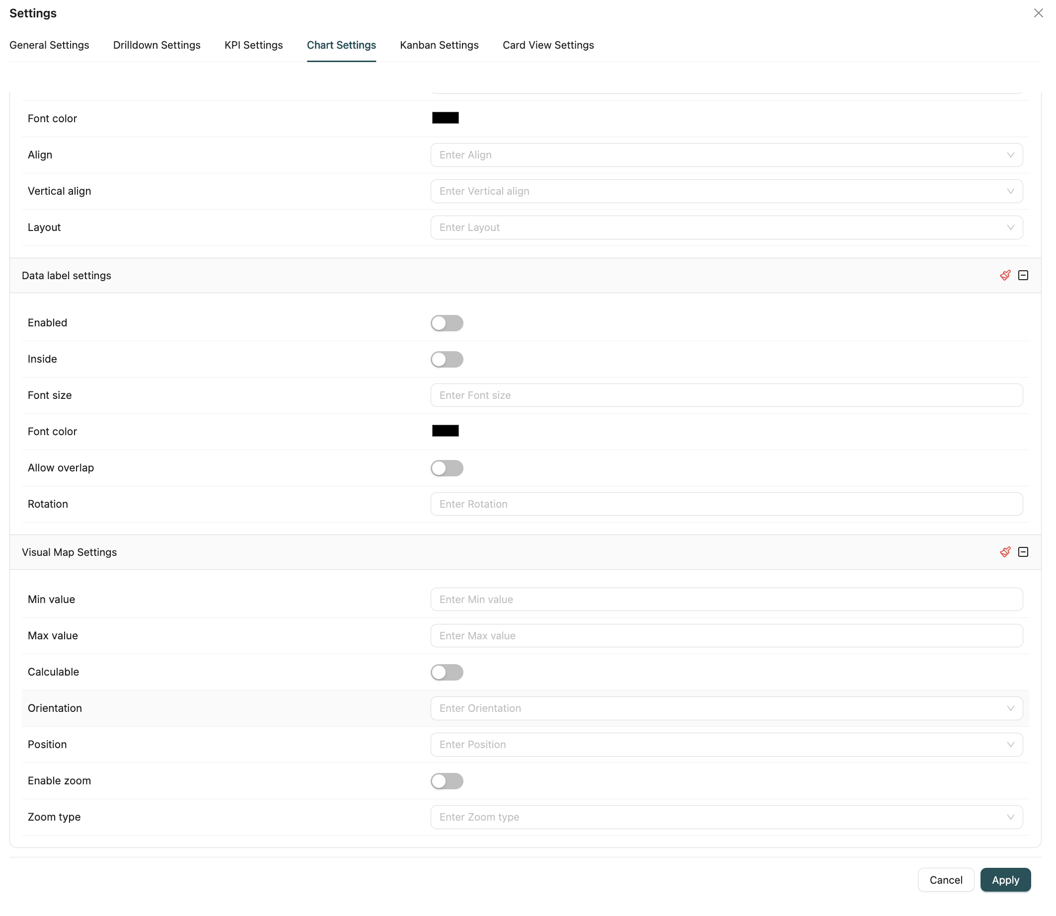
Data Label Settings
Configure labels displayed on chart elements:
- Enabled: Toggle to show or hide data labels
- Inside: Toggle to display labels inside chart elements
- Font Size: Set the font size for data labels
- Font Color: Set the color for data labels
- Allow Overlap: Toggle to allow overlapping labels
- Rotation: Rotate labels by degrees (0-90)
Visual Map Settings
Configure visual map (color scale) for heat maps and similar visualizations:
- Min Value: Set the minimum value for the color scale
- Max Value: Set the maximum value for the color scale
- Calculable: Toggle to enable interactive value calculation
- Orientation: Set orientation (Horizontal, Vertical)
- Position: Set position (Left, Center, Right)
- Enable Zoom: Toggle to enable zoom functionality
- Zoom Type: Select zoom type (Inside, Slider)
Kanban Settings
Configure settings specific to Kanban visualizations.
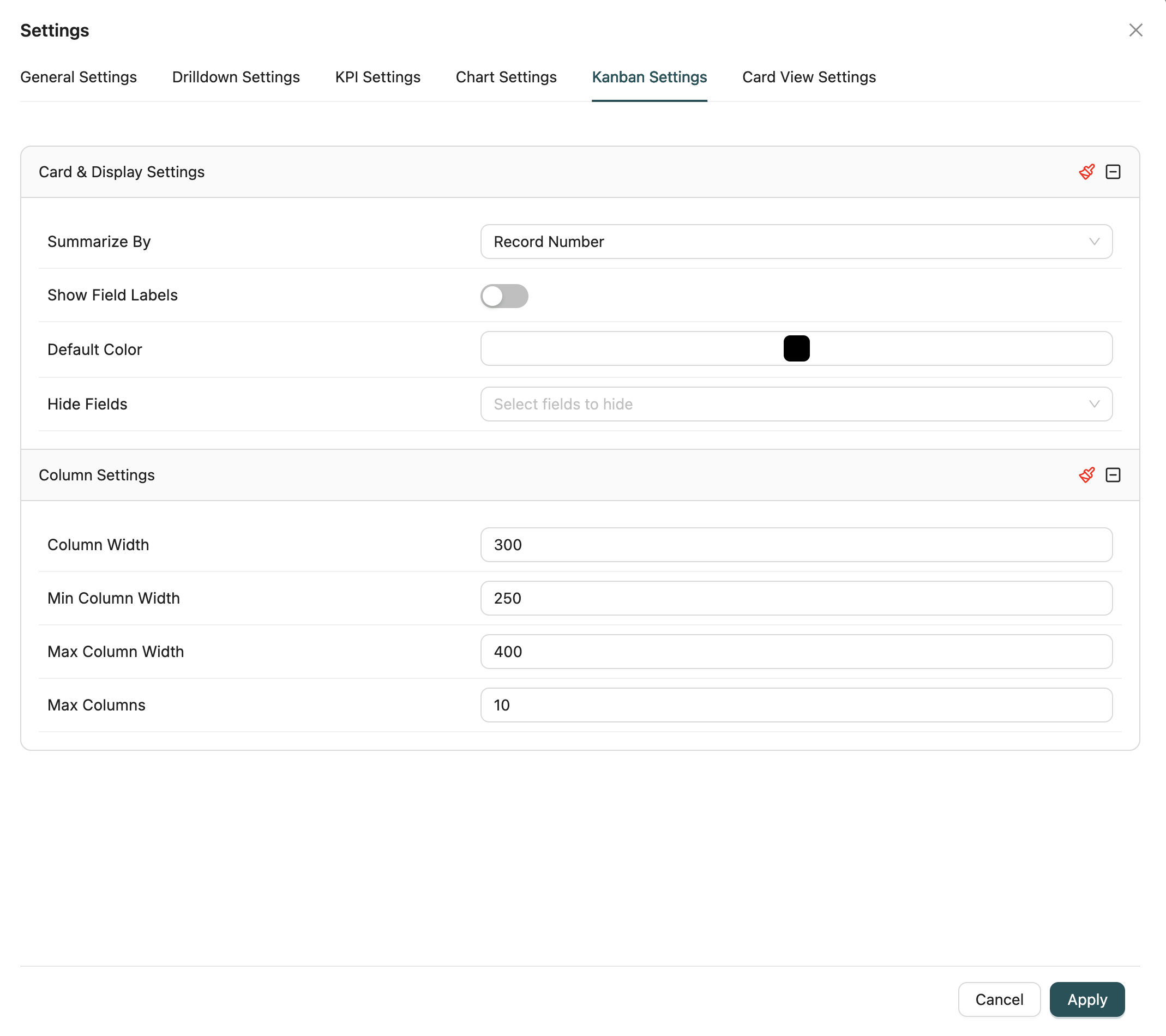
Card & Display Settings
Configure how cards are displayed in the Kanban board:
Summarize By
Select the field to use as the card title/summary. Options include:
- Record Number: Use the record's system ID
- Field Selection: Choose any field from the report's selected fields
Required: Yes
Show Field Labels
Toggle to display field labels alongside values on cards.
Default: Enabled
Default Color
Set the default color for cards. Cards can be colored based on grouping fields or use this default.
Hide Fields
Select fields to hide from card display. Useful for hiding system fields or less important data.
Multi-select: Yes
Column Settings
Configure Kanban column appearance:
- Column Width: Set the width of each column
- Min Column Width: Set the minimum column width
- Max Column Width: Set the maximum column width
- Max Columns: Set the maximum number of columns to display
Note: Column grouping is configured in the main report configuration (Group By fields), not in settings.
Card View Settings
Configure settings specific to Card View visualizations.
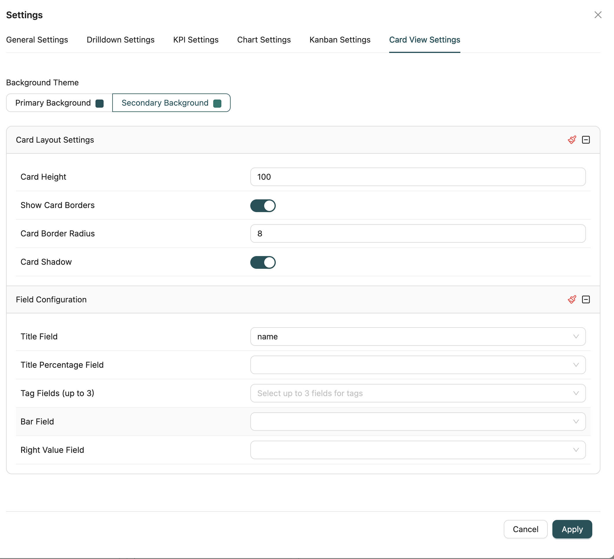
Background Theme
Select the background theme for cards:
- Primary Background: Uses the primary theme color
- Secondary Background: Uses the secondary/accent theme color
Default: Secondary
Card Layout Settings
Configure the appearance of individual cards:
- Card Height: Set the height of each card
- Show Card Borders: Toggle to show borders around cards
- Card Border Radius: Set the border radius for rounded corners
- Card Shadow: Toggle to add shadow effects to cards
Field Configuration
Configure which fields are displayed on cards:
Title Field
Select the field to display as the card title (main heading).
Required: Yes
Title Percentage Field
Select a numeric field to display as a percentage alongside the title.
Optional: Yes
Tag Fields
Select up to 3 fields to display as tags on the card.
Multi-select: Yes (up to 3 fields)
Bar Field
Select a numeric field to display as a progress bar on the card.
Optional: Yes
Right Value Field
Select a field to display on the right side of the card (typically a value or metric).
Optional: Yes
Report Filters
Configure filters to narrow down the data displayed in the report. Filters allow you to apply conditions that determine which records are included in the report results.
How to configure filters:
- Click the Filter icon in the top toolbar of the Report Designer
- The filter modal opens with two tabs:
- Fields Tab: Configure WHERE conditions for regular fields
- Measures Tab: Configure HAVING conditions for aggregated fields
Fields (WHERE Conditions)
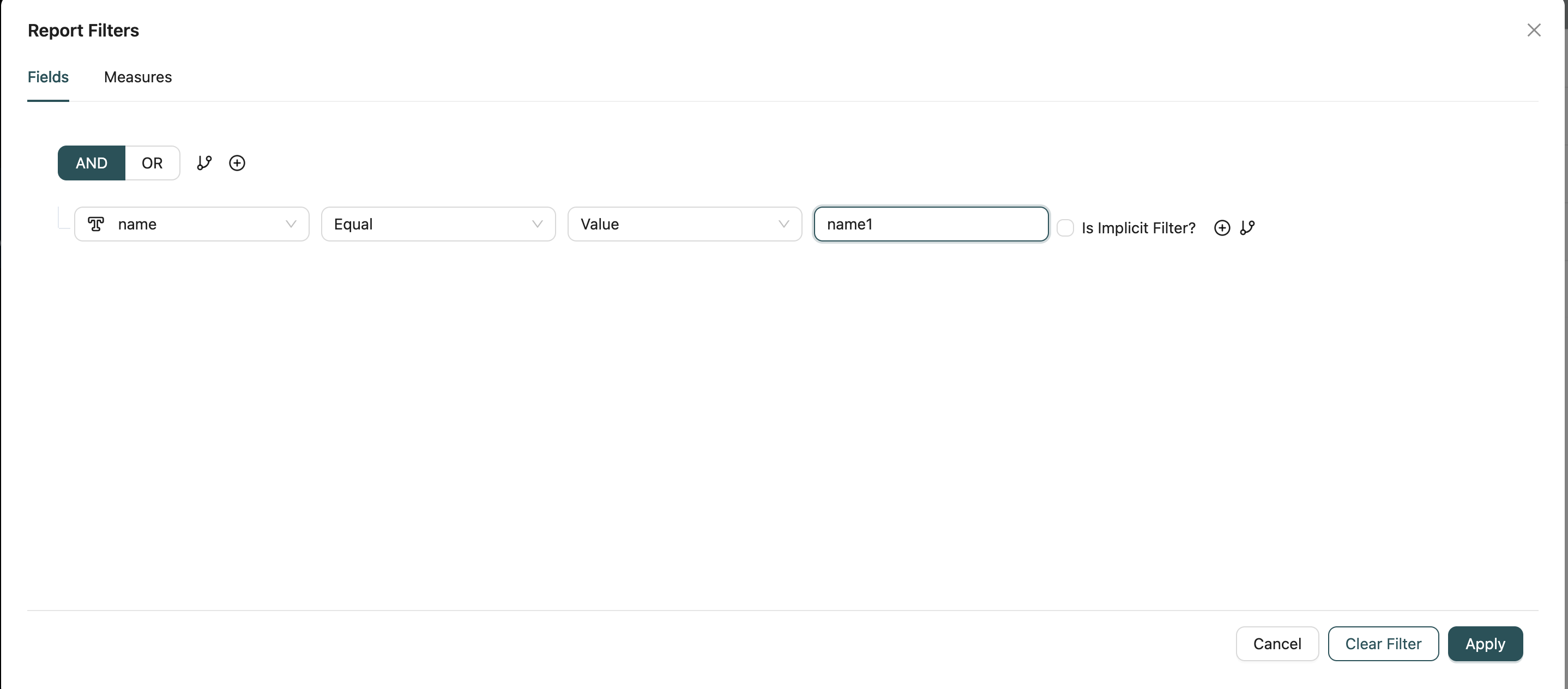
Filter data before aggregation using the Fields tab. This applies conditions directly to the source data.
Filter Options:
- Field Selection: Choose any field from the report's Object or related Objects
- Operators: Use comparison operators such as:
- Equals, Not Equals
- Greater Than, Less Than, Greater Than or Equal, Less Than or Equal
- Contains, Starts With, Ends With (for text fields)
- In, Not In (for multiple values)
- Is Null, Is Not Null
- Between (for ranges)
- Value Input: Enter filter values based on field type:
- Text values for text fields
- Numeric values for number fields
- Date picker for date fields
- Picklist selection for picklist fields
- Logic Operators: Combine multiple conditions with:
- AND: All conditions must be true
- OR: At least one condition must be true
- Nested Conditions: Create complex filter logic by grouping conditions with parentheses
Use Cases:
- Filter records by status, date range, or specific field values
- Exclude certain records from the report
- Show only records matching multiple criteria
Measures (HAVING Conditions)
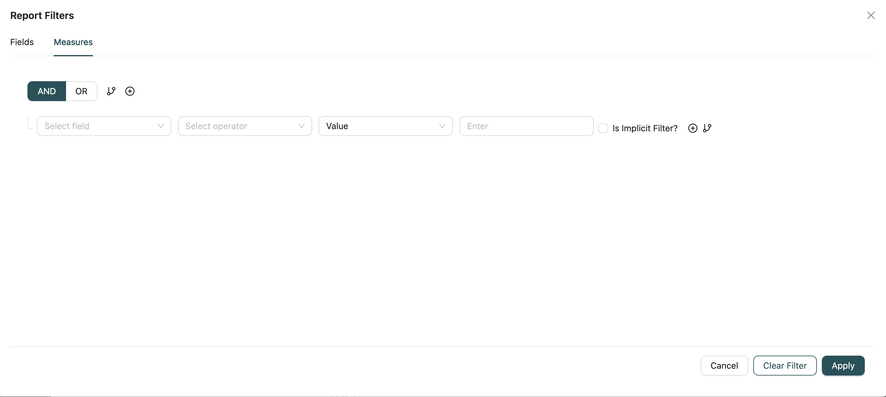
Filter aggregated data after grouping using the Measures tab. This applies conditions to calculated values and aggregated fields.
Filter Options:
- Aggregated Fields: Filter by fields that use aggregation functions (SUM, AVG, COUNT, MIN, MAX, etc.)
- Operators: Use comparison operators similar to Fields tab
- Value Comparison: Compare aggregated values against thresholds (e.g., SUM > 1000, AVG < 50)
- Logic Operators: Combine multiple measure conditions with AND/OR logic
Use Cases:
- Show only groups where total sales exceed a certain amount
- Filter out groups with low record counts
- Display only categories meeting specific performance criteria
Filter Management
Save Filters: Click "Save" to apply filters to the report. Filters are saved with the report configuration.
Clear Filters: Click "Clear Filter" to remove all filter conditions and reset the report to show all data.
Filter Persistence: Filters are saved as part of the report configuration and will be applied whenever the report is executed.
Dynamic Filters: Filters can be modified at any time by reopening the filter modal and adjusting conditions.
Best Practices:
- Use Fields tab filters for basic data filtering before aggregation
- Use Measures tab filters to refine results after grouping and aggregation
- Combine multiple conditions logically to create precise data subsets
- Test filters to ensure they return expected results
- Consider performance impact when filtering large datasets
Best Practices
General Settings
- Sort Options: Set default sorts that match the most common use case
- Max Read Limit: Set appropriate limits to balance performance and data completeness
- Custom Headers: Use custom headers when reports are used in dashboards for better user experience
- Report Filters: Use Fields tab for pre-aggregation filtering and Measures tab for post-aggregation filtering. Test filters to ensure they return expected results and consider performance impact on large datasets
Drill-Down Settings
- Relevant Fields: Configure drill-down only on fields that logically lead to related data
- Filter Mapping: Properly map fields to ensure drill-down views show relevant filtered data
- User Expectations: Ensure drill-down targets match user expectations for navigation
KPI Settings
- Font Size: Choose font sizes that are readable but not overwhelming
- Variance: Enable variance for KPIs where goal comparison is meaningful
- Goal Period: Select goal periods that match your business reporting cycles
Chart Settings
- Axis Labels: Configure axis labels for clarity and readability
- Data Labels: Use data labels sparingly to avoid cluttering charts
- Legends: Position legends where they don't obstruct chart data
Kanban Settings
- Card Summarization: Choose fields that clearly identify each card
- Column Width: Set column widths that accommodate card content without excessive scrolling
- Field Visibility: Hide fields that aren't essential for quick card scanning
Card View Settings
- Title Field: Choose a field that clearly identifies each card
- Tag Fields: Limit tags to the most important categorization fields
- Bar Fields: Use bar fields to show progress or relative values visually
Related Introduction
- Creating Reports - Learn how to create reports
- Reports Introduction - Overview of reports
- Objects Introduction - Understand the data models used in reports
- Workflows Introduction - Learn about workflows associated with reports