Creating Picklists
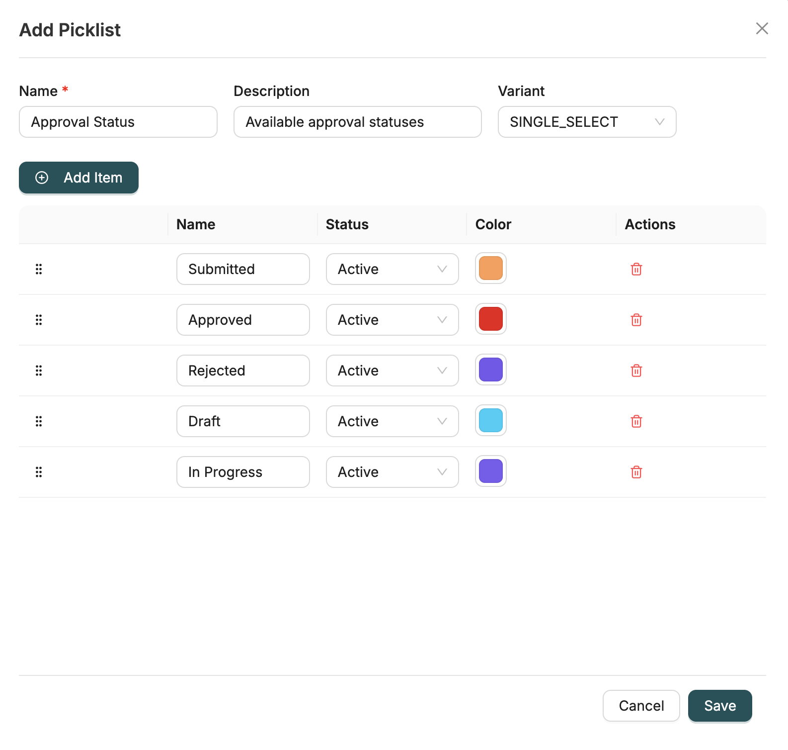
Picklists are created in a single modal where you configure the Picklist Category and add Picklist Items all at once. Both the category and its items are created together when you save.
Overview
A picklist consists of:
- Picklist Category: A container that groups related options (e.g., "Status", "Priority")
- Picklist Items: Individual options within the category (e.g., "Active", "Inactive", "Pending")
Creating a Picklist Category
A Picklist Category is the container for your picklist items. Configure the following fields:
Category Fields
| Field | Type | Description |
|---|---|---|
name | string | Unique name for the category (e.g., "Status", "Priority", "Country") - Required |
description | string | Optional description explaining the category's purpose |
variant | enum | Category variant: SINGLE_SELECT (single selection) or MULTI_SELECT (multiple selections) |
Note: The variant field determines whether users can select one option or multiple options from the picklist when used in Object fields.
Example: Creating a Status Category
When creating a Status category, configure:
- Name: "Record Status"
- Variant: SINGLE_SELECT (users can select one status at a time)
- Description: "Standard status options for records"
Adding Picklist Items
In the same modal, below the category fields, add items to the picklist. Each item represents an option users can select. Click the "Add Item" button to add new items to the table.
Item Fields
| Field | Type | Description |
|---|---|---|
name | string | Display name shown to users (e.g., "Active", "Inactive") - Required |
status | enum | Item status: ACTIVE (visible and selectable) or INACTIVE (hidden from selection) |
color | string | Optional color code for visual distinction (e.g., "#00FF00" for green) |
displayOrder | integer | Order in which the item appears in the dropdown - Automatically set by drag and drop |
Note: The display order is automatically determined by the position of items in the table. You can reorder items by dragging them up or down in the items table.
Example: Adding Status Items
When adding status items to a Status category, configure:
Item 1: Active
- Name: "Active"
- Status: ACTIVE
- Color: "#00FF00" (green)
Item 2: Inactive
- Name: "Inactive"
- Status: ACTIVE
- Color: "#FF0000" (red)
Item 3: Pending
- Name: "Pending"
- Status: ACTIVE
- Color: "#FFA500" (orange)
Complete Example: Creating a Priority Picklist
Step 1: Create the Category
Create a Priority category with:
- Name: "Priority"
- Variant: SINGLE_SELECT
- Description: "Priority levels for tasks and records"
Step 2: Add Items to the Category
Add the following items to the Priority category (drag to reorder as needed):
Item 1: Low
- Name: "Low"
- Status: ACTIVE
- Color: "#90EE90" (light green)
Item 2: Medium
- Name: "Medium"
- Status: ACTIVE
- Color: "#FFD700" (amber)
Item 3: High
- Name: "High"
- Status: ACTIVE
- Color: "#FF6347" (red)
Item 4: Critical
- Name: "Critical"
- Status: ACTIVE
- Color: "#DC143C" (crimson)
Best Practices
Naming Conventions
- Category Names: Use clear, descriptive names (e.g., "Record Status", "Task Priority")
- Item Names: Keep item names concise and consistent (e.g., "Active", "Inactive", not "Active Status", "Inactive Status")
Display Order
- Items are ordered by their position in the items table
- Drag and drop items to reorder them
- Most commonly used items should appear first
- Consider alphabetical ordering for long lists
Colors
- Use colors consistently across related picklists
- Choose colors that are accessible and distinguishable
- Use standard color codes (hex format:
#RRGGBB) - Colors help users quickly identify picklist values in forms and reports
Status Management
- Set
status: "ACTIVE"for items currently in use and visible in dropdowns - Set
status: "INACTIVE"to hide items without deleting them (useful for historical data or deprecated options) - Inactive items won't appear in dropdown selections but existing records using them remain valid
Using Picklists in Objects
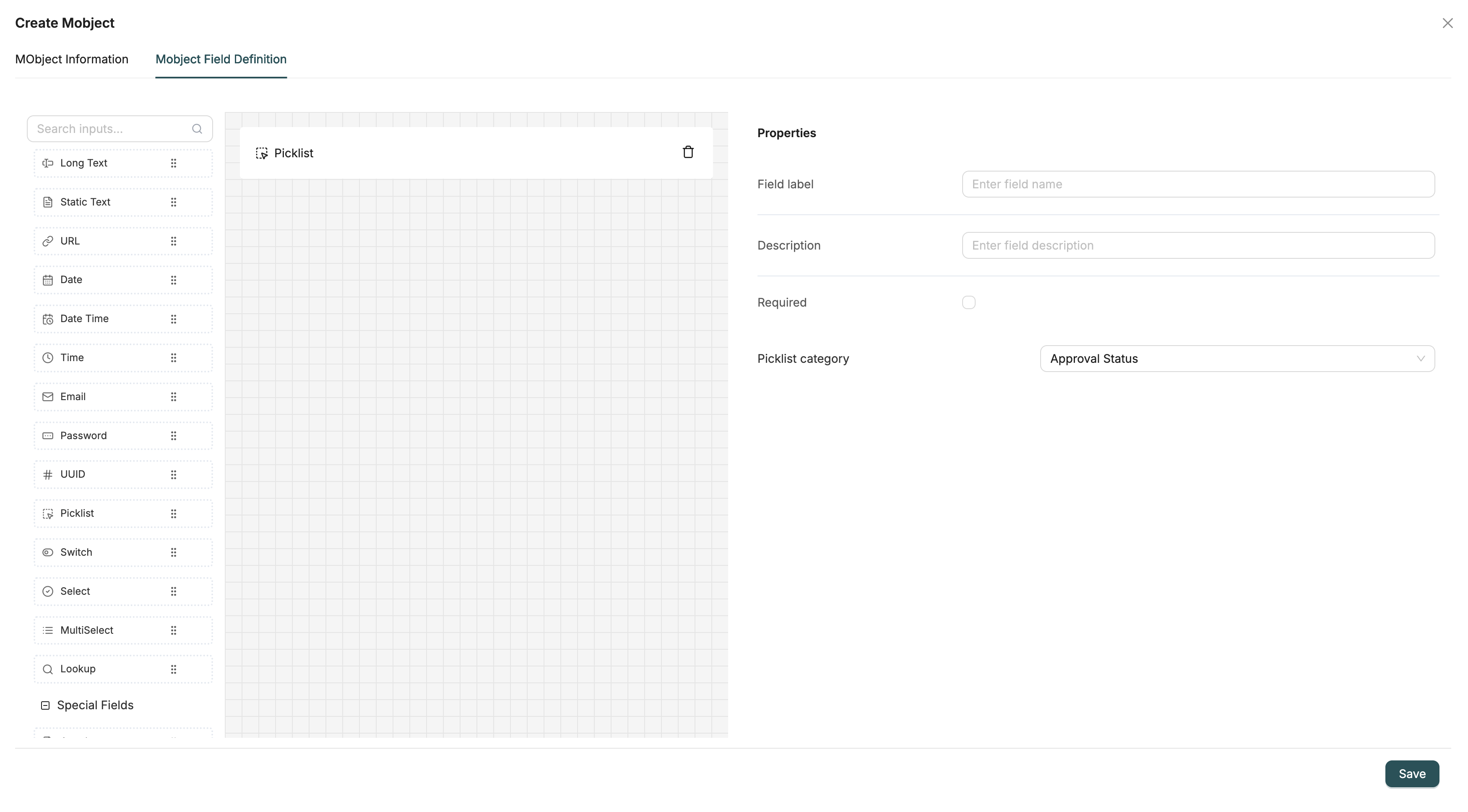
After creating a picklist, you can use it in Object fields:
- When defining a field in an Object, select the field type as Picklist
- Configure the field to reference your picklist category by selecting the category from the dropdown
- The picklist items will appear as dropdown options in forms
- The variant you selected when creating the picklist (SINGLE_SELECT or MULTI_SELECT) determines whether users can select one or multiple values
Next Steps
- Field Types: See how picklist fields work in Objects